Design for impact
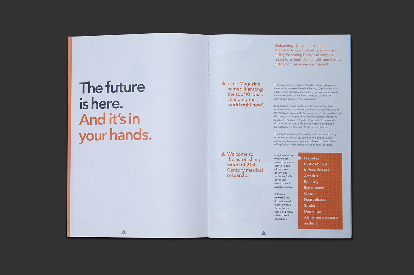
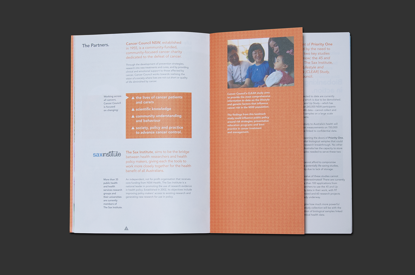
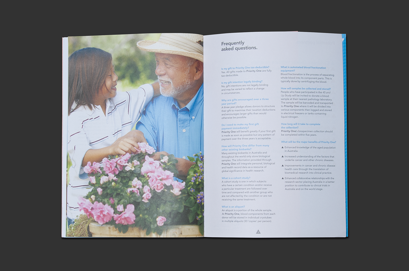
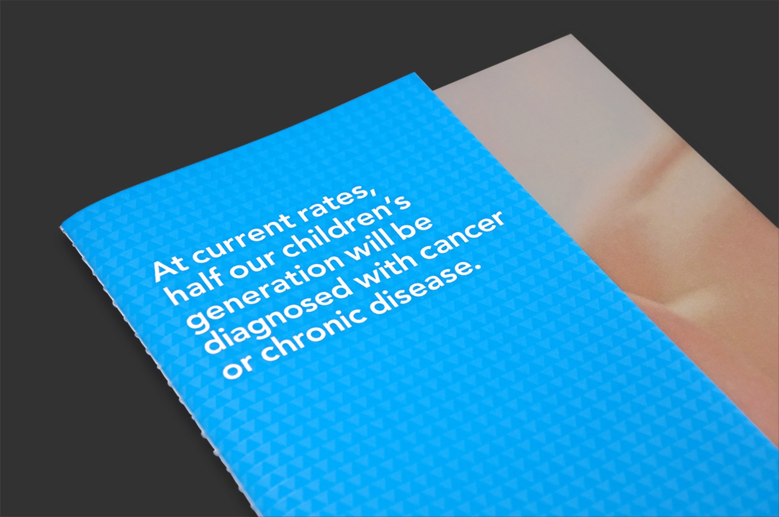
Cancer Council NSW was on the threshold of establishing Priority One, the nation’s largest biobank, with the potential to revolutionise research for cancer and chronic disease.
A brand identity was required that would communicate its scientific and humanitarian significance, along with a campaign inviting philanthropic high net-worth individuals and corporations to help raise an initial $8-10 million.
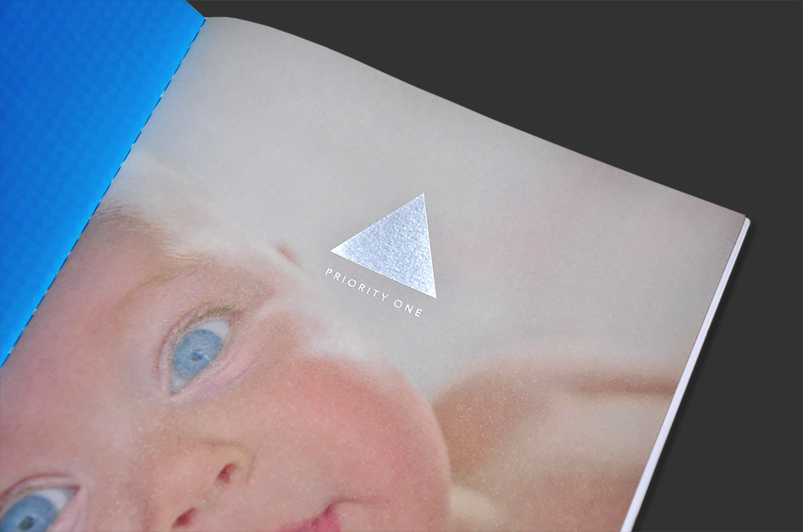
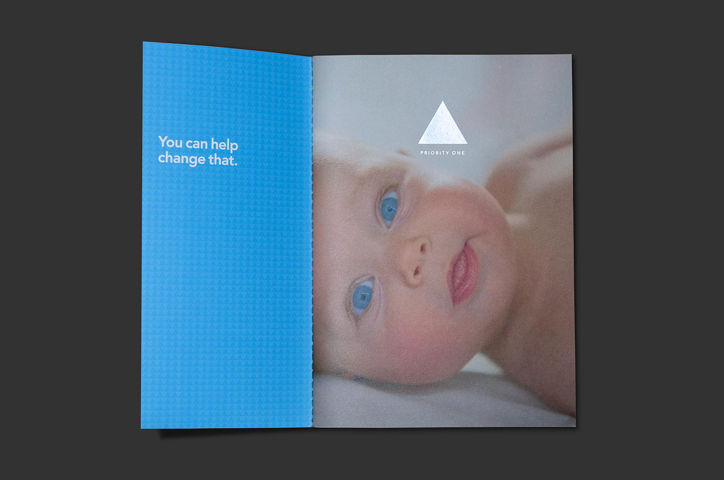
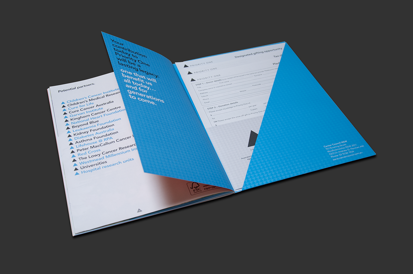
The ubiquitous triangle symbol represented urgency and priority; familiarity and longevity — and could symbolise the pinnacle of international scientific research of a truly significant issue in a simple and direct way.
This significance was emphasised in stark black and white and enhanced for special occasion where necessary. In the same way, it was important for language and tone of voice to be both confronting and informative.